A Design Company

A Design Company

A Design Company featuring great design, architecture, fashion, graphics and innovation from across the globe.


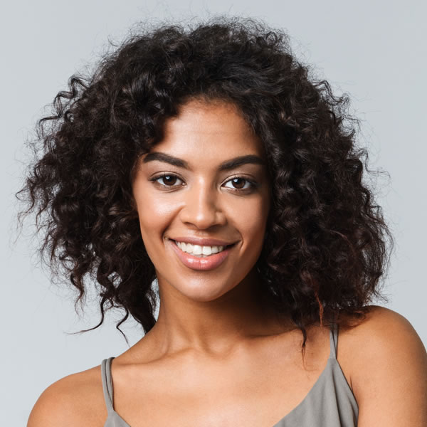
Woman Flower

This collection is inspired by the exaggerated clothing styles of medieval European ladies and the bird's eye view shapes. The designer extracted the forms of the two and used them as creative prototypes and combined with product design to form a unique shape and fashion sense, showing a rich and dynamic form.

Continue reading


Xarin

The main objective was to highlight Xarin packaging among the variety of labels at points of sale. Therefore, the label has an unique geometry and maximally concise design. АА Winery is a brand created by an agricultural holding in 2017. The peasant farm holding consists of only two persons, this is a key advantage. This winery is not big, for this reason each bottle is warmed by the warmth of people who are truly fond of their work. Xarin Alexander and his partner Zvyagintsev Alexander, who is a member of the peasant farm holding, have the work experience in wine growing for over 30 years.

Continue reading


Band3

Mi Band 3 is a low profile product that targets the lower end of the sports headset market. For the packaging design, designers wish to emphasize the youth and energy frequently associated with this group of users, so the packaging uses a simple figure of “3” as the visual point, surrounded by a pattern design that draws inspiration from the athletics track. This pattern extends over the entire package, conveying the dynamical of sports using simple lines. Band 3 use different colors on the packaging to distinguish the versions.

Continue reading


Shiny Meadow A2

The design is elaborated to manifest a picture that the freshest milk produced in the pasture just now is carried to the urban table through time and space, as if the first sunshine arouses us in the morning. The bottle design took inspiration from the European classic milk glass bottle and redesigned it with a modern vision. Behind the concept, there is a cultural heritage across nationalities, creating a romantic, affable and sincerity feeling, making this iconic shape even more attractive.

Continue reading


Sierra Cantabria

The design of this extensive family of wines has the mission of collecting the manifesto of 150 years of history to build the language of its labels. The different variants that it has give rise to a very large family, whose brand is worked together, but also retains subtle differences between one of the bottles to give rise to a range full of elegance and expressiveness. Using the winery's own heraldic symbols in combination with a hierarchy of typographic elements, manages to create more than 50 combinations of labels, with a serene and elegant design.

Continue reading


Kailani

Arome Agency's works on the graphic identity and artistic line for Kailani packaging are based on minimal and clean design. This minimalism is in line with the product that has only one ingredient, magnesium. The typography chosen is strong and typed. It characterizes both the strength of the mineral magnesium and the strength of the product, which restores vitality and energy to consumers.

Continue reading